Stem and leaf plots show a lot of numbers in a small area. The numbers on the left are the whole number and the numbers on the right are the decimals. The line in the middle is the decimal point. Each number on the right is considered a new number.
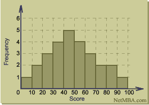
Hisograms show how the frequency of certain points of data. A common use of a histogram is to show exam grades and how often they showed up to find the average and median scores.
A windrose shows the direction and speed of wind in a certain area. In this location, when the wind is blowing west, it is much stronger on average then when it is blowing east.
This cimograph shows the average temperature and rainfall in certain months of the year. The rainfall is represented in bars and temperature is represented in a line graph.
A population profile shows data about how many males/females there are in a country (or countries) according to their age. This map highlights how low the life expectancy is in under-developed countries.
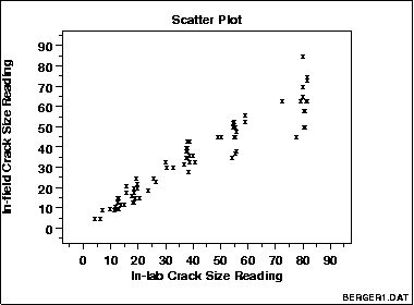
Scatterplots show the relationship between dependant and independant variables. They sometimes show correlation, but sometimes there could be no correlation at all. This scatterplot shows a positive correlation between the two.
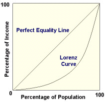
The Lorenz curve shows the perfect equality line and all the areas of inequality. This map shows what percentage of the population makes what percentage of income.
A nominal area choropleth map uses nominal data. Nominal data is data that exists in name only. For example if you were creating a map using the highest percentage of race per state and the subcategories were black, hispanic, etc. In this map, red represents Republican, and blue represents Democrat.
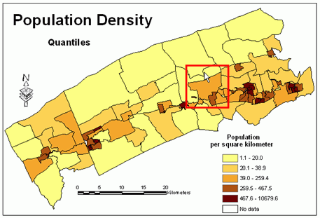
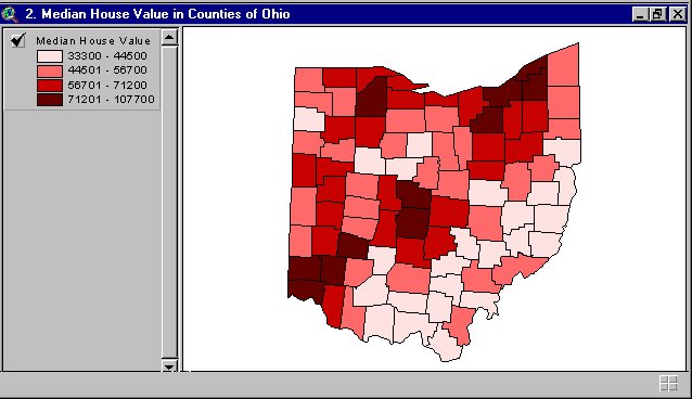
In a standardized choropleth map, all the data is to one unit. For example, all of the data could be per square mile. This map is per square kilometer.
A continuously variable proportional circle map uses circles to depict data. The size of the circle in each area depends how much data was collected from that area.
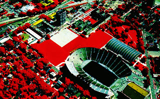
DOQQ stands for Digital Orthophoto Quarter Quads. The photos are developed from aerial images and they can be shown in the actual color or infra-red. This image is shown in infra-red.
An isopleth map is basically a contour map of any kind of data. This map shows the amount of H1N1 death in the state of California. The darker the read, the more deaths in that area.
Isobars are used to predict weather patterns. This map of isobars shows where the low pressure system is located. The L signifies a low pressure system.
LIDAR stands for Light Detection and Ranging. It shows the depth of the ground using airborne scanning technology. It is accurate to within 15 centimeters.
The Doppler Radar helps predict weather patterns. This image shows what looks like a hurricane over Florida. The middle of it is showed in yellow and red.
This is a photo taken from up above with an infrared camera. It seems that the red area are vegetation. The green areas look like they are cement and the yellow is roofing.
The Doppler radar is an example of a cartographic animation. This image would have been on the news showing you where in the United States it was going to rain. The green portion shows where the heaviest rain was going to be. The pink portion means snow is in the area.
A Cartogram shows data by distorting an area so that each 'square' will have a value. This map shows electoral votes. It still resembles the United States, but it distorted. The more electoral votes a state has, the more squares it will be made up of.
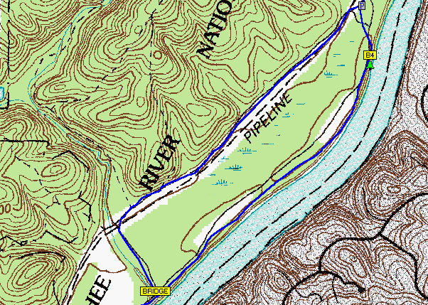
Flow maps can be very complex or they can be very simple like this one. This map is simply showing a routine. One step at a time, just follow the arrows.
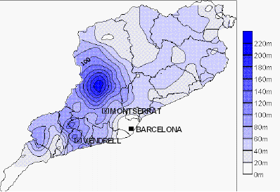
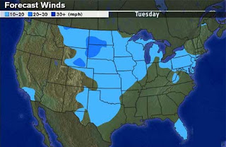
Isoline maps are used for forecasting the weather. Everything between lines is assigned a certain value. The areas between the lines can be colored in like this map does. This map is showing wind speed across the United States.
In a proportional circle map, the circles will be assigned a value according to their size. Normally, the bigger the dot, the larger the value. In this map, the larger the circle, the bigger the Hispanic Population in Chicago area.
A chloropleth map is a type of thematic map. As you can see by the legend, the darker the color green, the more Hispanic people live in that area. The more south you move in Florida, the more Hispanic people there are.
This dot distribution map shows where the population is located in the United States. The more dense the dots are, the more people live there. So as you can see the west has a bigger population than the east.
Propaganda maps try to persuade you to think one way or another. This map is trying to get you to root for the USA and really hate the USSR. It says the USSR is full of Godless communists, liars and spies.
A hypsometric map is a type of topographic map. It shows elevation by changing colors. In this map, the lowest points are blue and the highest points are light brown.
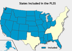
The public land survey system helps subdivide the land under ownership. It divides the land owned by the Federal Government which benefits the average citizen. The map above shows that most of the east coast and Texas are not part of the PLSS.
This a picture of a cadastral map. A cadastral map shows ownership of land parcels and it also shows the boundaries of the parcels. The map above shows certain areas seperated by thick black lines and different colors.
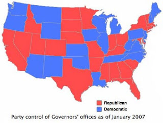
This is a thematic map showing the political party of the state's governor. Red means Republican and blue means Democrat. The state of Florida is red so that means in 2007, the Governor's offices was Republican


